New Search Engine Land website

Search Engine Land, or SEL as us geeks like to call it have launched a new website. If you're not familiar with SEL, it's one of the leading resources online for all things Search. SEL was in great need of a revamp, but has this revamp gained the approval of their industry peers.
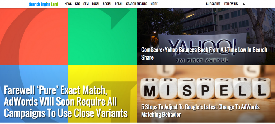
New Search Engine Land Website

A thread was created whereby feedback was captured and unfortunately the feedback isn't the most positive. One gentleman, Shaun Myandee, broke it down like this: Above the fold: Horrendous. Below the fold: Excellent. The big visual thing at the top of the page is really way too busy and is incredibly hard to even read. On a more general point, these sorts of visual things work well with media that actually has some visual element. Search isn't exactly one of them. We're going to see the same images (or similar) over and over again. They use the same four coloured squares graphic twice even in this one, for goodness' sake! Scroll down a bit and its like night and day. Its clear, clean and nice and easy to read. Can't really ask for more. My only criticism there is that they could expand that description snippet a little. they have space in teh design for at least one more line of text in there. At the moment they all cut off mid-thought. .. it would appear that people are agreeing with him. For SEL this is naturally really great feedback because it's from their fans and hopefully they'll be in a position to make some changes to better suit the audiences wants. From our side we also tend to agree; TechCrunch and Mashable (giant technology websites) have gone through redesigns over the years and very similar ones to this. In both cases people were against the attempt to create something more advanced on the Internet. These news/blog sites are best served with articles top to bottom, offering the opportunity for readers to easily navigate and not have huge images pushed in front of their faces. Mashable has stayed with this sort of design, but design changes have been made from what we can see to better suit a top to bottom, easy to navigate approach. TechCrunch has done the same and we wouldn't be surprised if SEL makes some changes to the crazy above the fold area. Interestingly, viewing the website in mobile mode, it's responsive of course, but loads wonderfully for the reader who wants to read the news top to bottom. Have you seen the website, what are your thoughts?

Leave a Reply

Recent Blog Posts

Recent Comments

Blog Post Archives